I
had an old wooden stool that I had been wanting to repurpose as a
creative display piece. I painted it white and decoupaged the top square
with copies of one of my old concert band compositions. I cut up a
couple of pages into different sizes and shapes and added decoupage glue sealer on top. I had a blast transforming it!
Tuesday, September 30, 2014
Tuesday, September 16, 2014
Tuesday, September 2, 2014
Calla's Caress
Calla's Caress is a mixed media drawing. I used graphite pencils, colored pencils and pastels. I drew the piece initially in graphite pencil, then added color with colored pencils and lastly, I completed the wall and a few touches in pastels. Here are some of the developmental stages of the piece, followed by the completed piece, once again.
Enjoy!
Friday, August 15, 2014
Monday, August 11, 2014
Jewellspiration at Camp Yofi
Last week at a family summer camp for Jewish autism families, I had a wonderful opportunity to get a little creative. It was on an evening of some respite time for myself, along with some of the other autism moms. It is absolutely one of the best perks of Camp Yofi at Ramah Darom in Clayton GA. This precious time to connect with others, relax and recharge; it's nothing short of golden.
In the first photo bellow: I made a set of necklace and earrings with the hamsa symbol of the hand. The hamsas are in a copper tone (it's hard to see in the photo).
Here's a little overview about the hamsa symbol from Wikipedia:
"The hamsa (Arabic: خمسة khamsah, also romanized khamsa, meaning lit. "five") is a palm-shaped amulet popular throughout the Middle East and North Africa, and commonly used in jewelry and wall hangings.[1][2]
Depicting the open right hand, an image recognized and used as a sign
of protection in many societies throughout history, the hamsa is
believed to provide defense against the evil eye. The symbol predates Judaism, Christianity and Islam.[citation needed] In Islam, it is also known as the hand of Fatima, so named to commemorate Muhammad's daughter Fatima Zahra (c. 605 or 615[3] – 633). Levantine Christians call it the hand of Mary, for the Virgin Mary. Jews refer to it as the hand of Miriam in remembrance of the biblical Miriam, sister of Moses and Aaron".
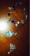
In this second photo: I made a set of necklace and a bracelet. The pendant of the necklace has a silver hamsa with an attachment of a star of David. I also made an interchangeable pendant (on the bottom of the photo) of a vintage key and lock, a gift for my daughter. I made her another interchangeable pendant that isn't captured in this photo, of a heart and star of David. She wore it today for the first time, as her first choice. It was very sweet!
I realized while making the jewellery, just how much I was enjoying myself. It felt like a very similar rush that I experience from drawing or playing the piano. Therefore, I plan on making many more pieces, as a way of unwinding and finding additional outlets for creative energy. I can't wait to go get some tools and beads for the new pieces. Thank you Camp Yofi, for putting a sparkle in my week!
Monday, August 4, 2014
The Kingfisher Bird
Here are a couple of earlier sketches followed by the completed drawing again.
The completed drawing:
Monday, July 28, 2014
Departures
I created this drawing in graphite pencils. The emotions in this drawing are a reflection of feelings that families face during a time of deployment. Five years ago, our family faced such a deployment. Jake was almost two years old, Alex was a Captain in the Air Force and it was only our second year living a military lifestyle. During that half a year, as our friends and family know, I was pregnant with our twins while starting to notice signs in Jake, of what we later learned, was autism. I title this drawing Departures (and not Deployment), because this one big event of the deployment was not only a physical departure (for Alex), but also simultaneous departures, or beginnings, in our lives. These beginnings took us in different directions, that ultimately condensed into a single focus of family and togetherness.
Here is the progression of the stages of Departures:Thursday, June 26, 2014
Saturday, June 21, 2014
Tuesday, June 10, 2014
Tuneful Nectar
I drew a humming bird with flowers in colored pencils. I had considered calling it something along the lines of: Humming Bird, but decided to go against the obvious choice. I then came up with: Tuneful Nectar, instead. I hope that you enjoy it!
I still prefer shading much better with graphite, as it is much easier to work with and doesn't put up much resistance when I work with layering. However, I enjoyed the obvious aspect of color and creating in a new medium.
Black and white leaves much more to the imagination in the sense that the viewer can interpret the drawing with more freedom, even though a colorless medium is deceptively non-restricting. I think that when I have some more time and our family gets settled into our new abode, I will start up painting once again. Any suggestions on what to create? If your idea resonates with me, I may take you up on it!
Wednesday, June 4, 2014
Rising Angel
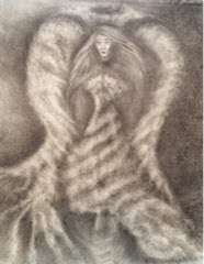
Rising Angel was done in charcoal pencil. I love working with the idea of being suspended, or floating, between the ground and the sky. I'm also into shading and creating multidimensional aspects. I wanted the wings to look like they are made out of soft clouds, unlike realistic bird wings. Similarly, the material of the dress is also cloud like; blurring the imagery between reality and fantasy.
This second drawing is the original version of Rising Angel. I later modified it to have shorter wings and dress, as well as a vortex for the angel to ascend through, up to the night's sky.

(Second version)
Tuesday, May 27, 2014
Between Dark and Light Clouds
My last charcoal drawing is of a woman's image. I got the idea for the title from a recent trip in the spring to Ireland. It felt like depending on which cloud we were standing under, it would either be raining or sunny. It was windy regardless, so this gave me the idea of being suspended between light and dark clouds. Depending on what is going on in our lives, it directly affects our moods, just as light and dark clouds shift and flow above our heads. We also shift and flow with the different kinds of clouds in our lives, or moods and different types of energy we experience. The wind ties it all together; it is the energy which moves us from dark to light and back.
And as the old Irish saying goes:
"...May the wind be always at your back, May the sunshine warm upon your face"....
 |
| Between Dark and Light Clouds ~ Charcoal Pencils |
Monday, April 7, 2014
My Seattle Skyline
Last week, a group of friends and I went out to a painting class, where we were all taught how to paint the same painting, the Montgomery skyline. A couple of the ladies were from San Antonio, so they painted that skyline, and I painted the Seattle skyline. Since I have many fond memories of my time there, it only seemed natural for me to do so; but it was a last minute call. I'm so glad that I went for it. I share with you here, the three main stages of the evolution of the painting. The painting style is in the flare of Van Gough's Starry Night.
Stage 1. I created the sky with long sideways brush strokes in shades of blue.
Stage 2. I painted the black skyline and afterwards filled in the buildings in black. I then used white for highlighting the edges of the buildings. I blended it in with the black paint, followed by dry brush strokes at the end to create a shimmering effect, as well as to add texture. From the bottom of the buildings on downwards, I painted the rest of the canvas black. Over it, in different shades of blue, I created the water with fast random sideways brush strokes of differing lengths.
3. Completing the painting:
Next was the sky. I made the moon, a large yellow circle, and other smaller yellow and white circles (stars). I worked with shades of yellow with yellow and white paint. Then, in small thin brush strokes, wavelike motions, and a small round brush, I created the shimmering starry night effect. The little dashed wavelike lines are in yellow, white and shades of blue, blending in with the night sky. Lastly, I created the shimmering lights reflecting over the water. I painted small dots, thick at the base and thinning out towards the tops, like a bunch of grapes, and then, in the opposite direction, towards the bottom of the canvas. At the base of the buildings line, in shades of blue, I used long grass like shaped strokes to create the reflection of the water onto the buildings. After I took my painting home, I hung it over a large corner photo
stand. We have a water theme I think, starting in the living room. I hope to continue growing this theme with other paintings.
Friday, April 4, 2014
The Ringgo Bird
Someone
had asked me this week to create a drawing for him that is inspired by a
graphic of a little bird that had music notation coming out of its wings. I
share here with you the stages of evolution of my drawing. I titled the drawing after the name of the person who requested this drawing, perhaps coming up with my own genre of a musical inspired species of birds. I had a
blast making it!
Stage 1.
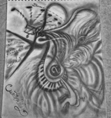
I started by drawing a diagonal treble clef as the bird's body and later came back to it and added the piano keys. The graphic's bird had the beak small and closed, so I did the opposite, I wanted it to be more aggressive and animated. I later added flames and fumes projecting out of the Ringgo's beak. I wanted both head and feet to have some sort of music notation, so the feet turned into music notes bracketed by a duple sign. On the Ringgo's head I drew a crest made up of a crown-like bracketed quintuplet fixture, as well as tremolo dashes on each of the notes' stems.
Stage 2.
I made the eye diamond shaped and angular. I always like juxtapositions of opposites: in this case, it's the angular eye and beak in contrast to soft long flowy feathers and the rounded treble clef. Next, I drew the peacock-like tail feather, which inspired me to continue the light and dark striped texture of the rest of the bird's feathers. I used a cotton ball to do my shading and an eraser for my highlighting. I then go over the lighted feathers with the darkened cotton ball lightly, in order to blend in the shades some more.
Stage 3: Competed drawing
I use the darkened cotton ball to shade around the edges of the paper. I wrote the title of the piece over the flames coming out of the bird's mouth, as if the text is a part of that texture. I chose only a few elements to be in the darkest charcoal shade: the note heads on the crown, the beak, the eye and long eyelash-like wave, and the outline on the left part of the treble clef. Having only a few elements of the drawing in the darkest shade, gives the observer's eye a focus.

I hope that you've enjoyed my post.
Stop back at Creationlily from time to time
to see some of my new creations.
Subscribe to:
Posts (Atom)


